Freight Booklet

Typorgaphy, layout, and visual hierarchy

Design Solution
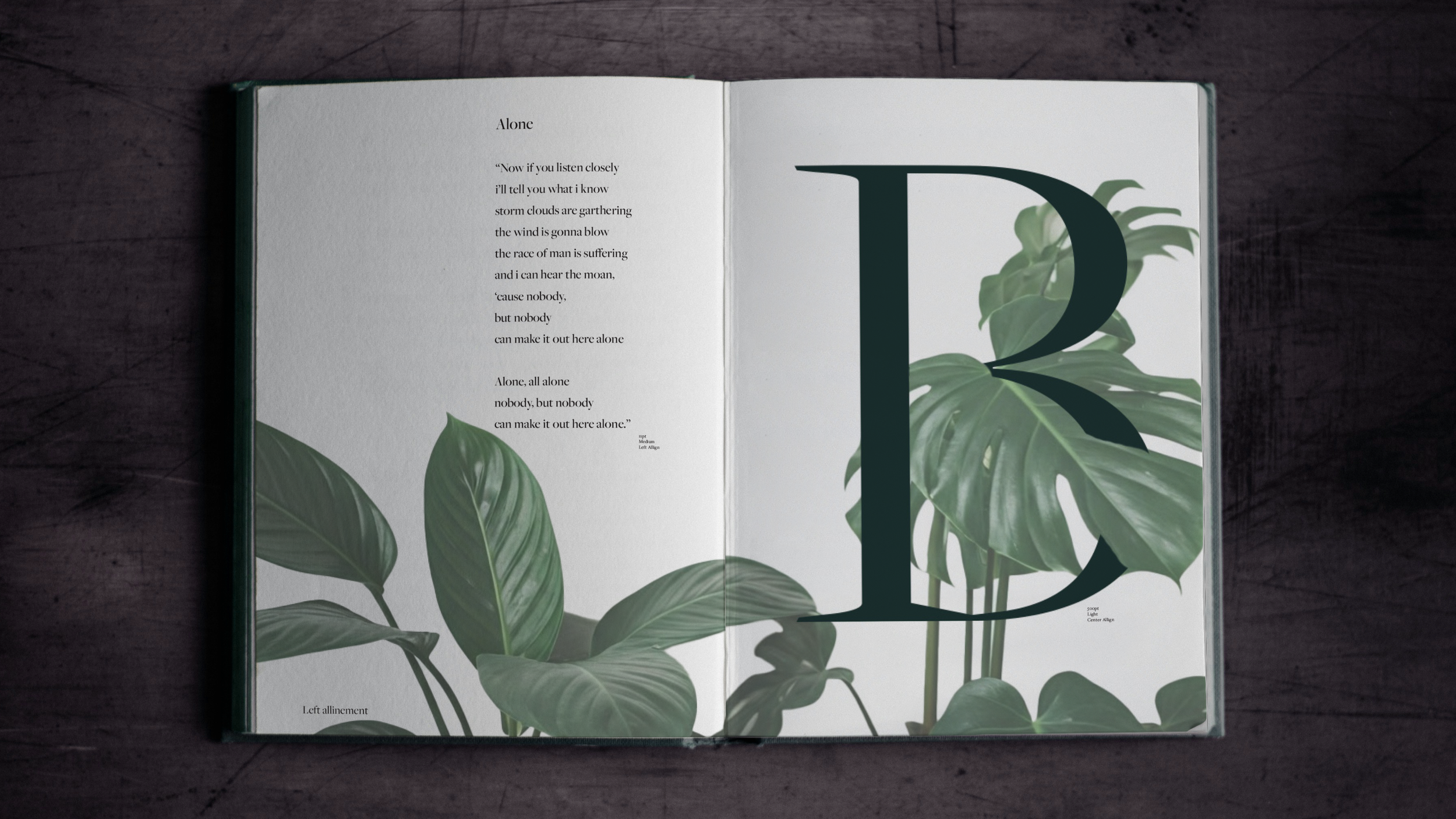
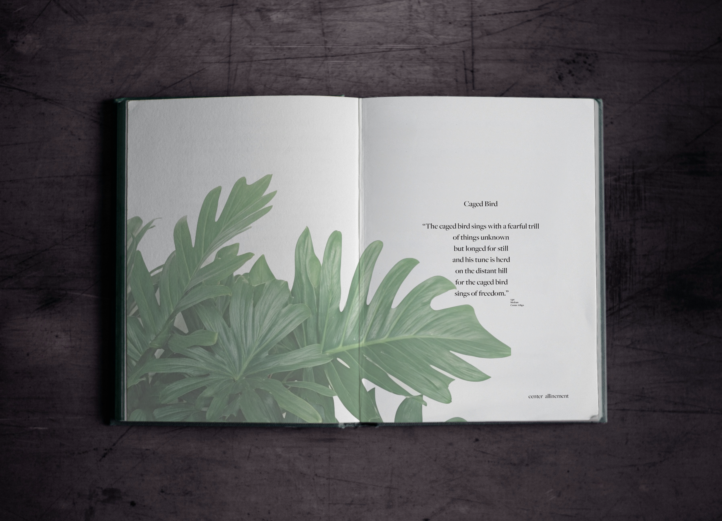
The solution was a modern, editorial-style booklet that showcases Freight through structured layouts and selected literary excerpts. Each spread emphasizes a different typographic principle weights, kerning, alignment, and style while using consistent grids and negative space for clarity. Subtle plant imagery provides an organic counterpoint to the type’s precision, underscoring Freight’s ability to balance warmth with function in a wide range of applications.
Design Challenge
The challenge was to create a type specimen booklet that highlighted the Freight type family while keeping typography and layout as the central focus. The project required exploring hierarchy, scale, alignment, and spacing to demonstrate the versatility of Freight across both text and display settings.
History
Designed by Joshua Darden in 2004–2005, Freight is a comprehensive type superfamily built for versatility across print and digital use. With branches like Freight Sans, Serif, Display, Text, and Micro, the family balances modern clarity with humanist warmth, making it a popular choice for editorial design, branding, and corporate communication.
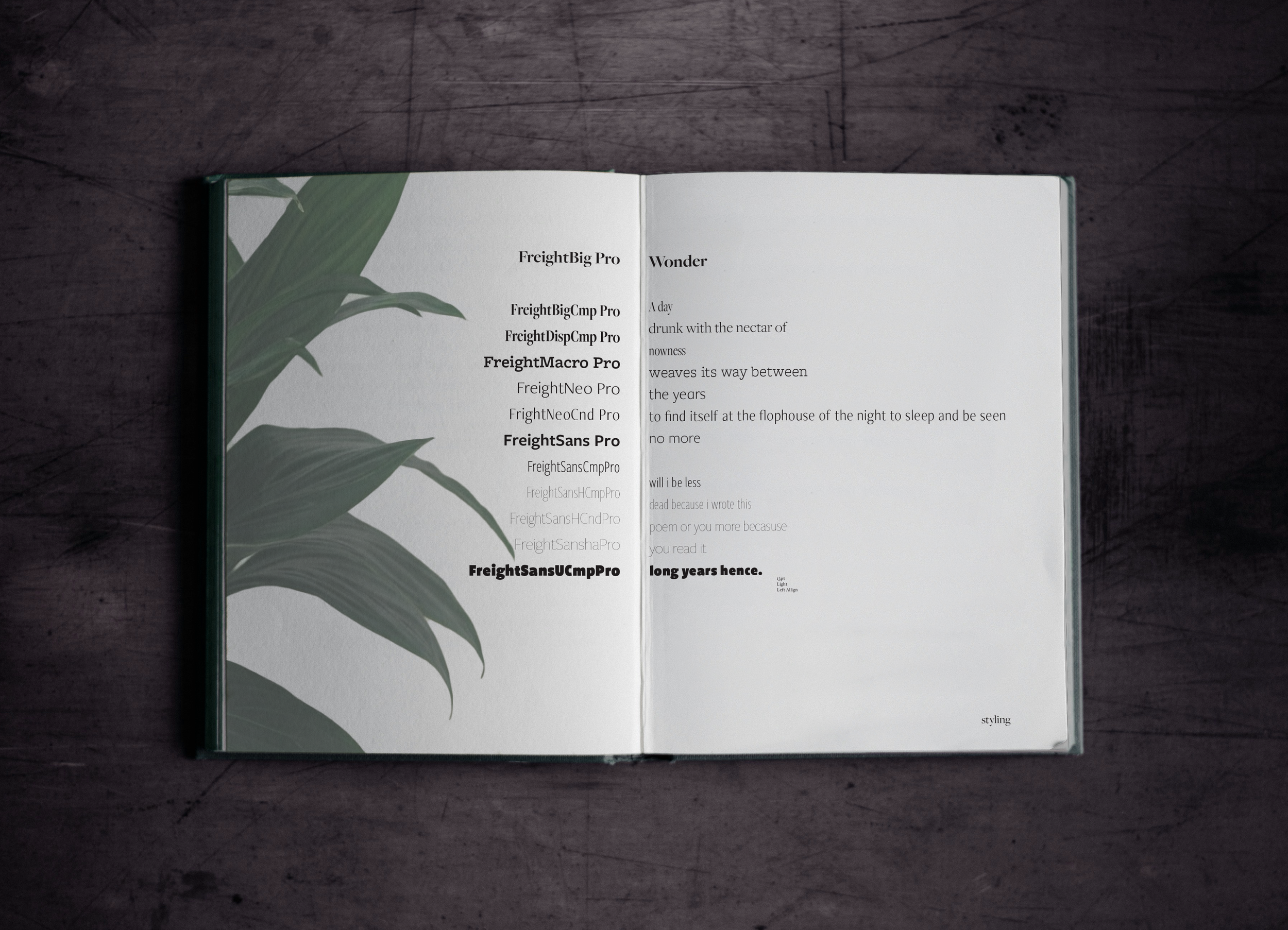


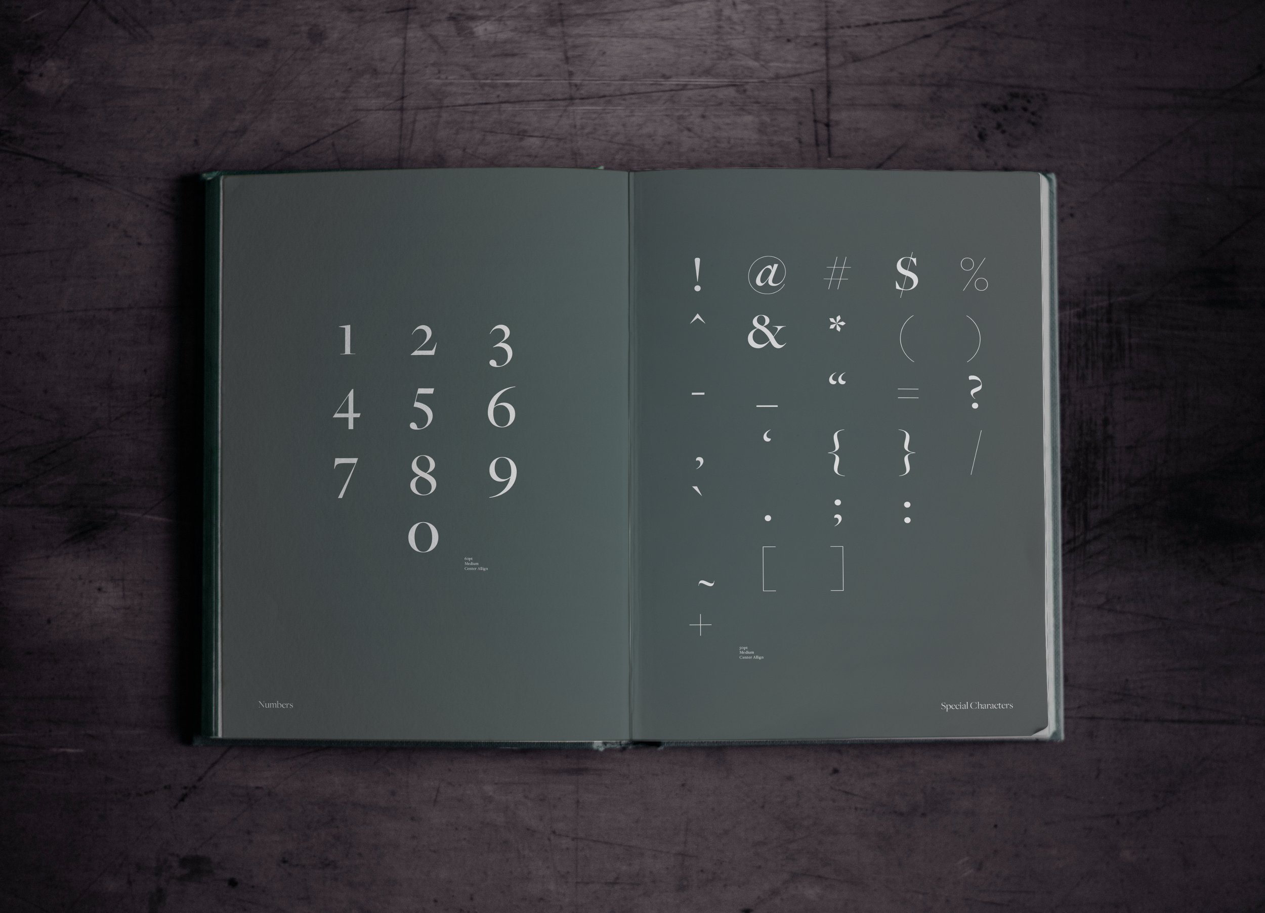
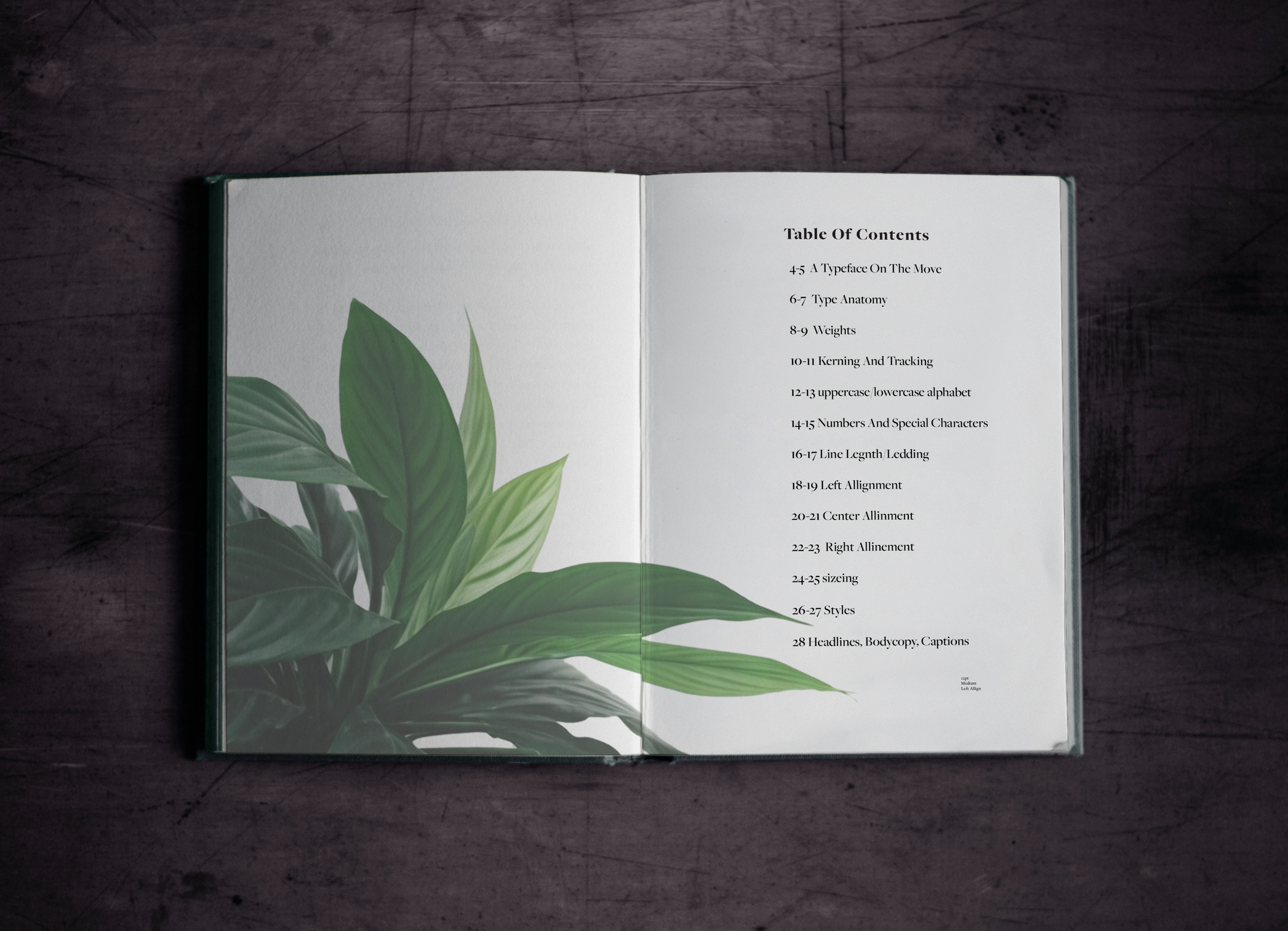
This project explores the Freight typeface through a full, custom-designed specimen book. Each spread studies the type family’s structure, rhythm, and personality, pairing detailed typographic breakdowns with organic plant photography to highlight contrast, elegance, and movement. The book includes alphabet sets, numerals, special characters, and layout demonstrations that show how the typeface performs in real editorial settings. By combining expressive imagery with thoughtful composition, this specimen showcases both the versatility of Freight and my approach to creating refined, publication-style typography.